Adam Thompson
Noom
A better food-logging experience without compromising functionality.
Users were having trouble navigating the core meal-logging flow because the buttons weren’t obvious and changed behaviour depending on use case. We needed to fix this.
I consolidated the user flow and UI, making it consistent in all use cases. Through meticulous user-testing we designed an interface that eliminated hesitation and uncertainty.
Problem
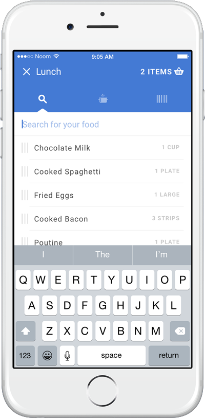
Noom—based in midtown Manhattan—combats obesity, diabetes, and hypertension with lifestyle and behaviour change. Meal logging is a must-have feature in the app that gives constructive feedback on users' eating habits. Logging the food you’ve eaten must be quick and intuitive, and give insightful feedback.
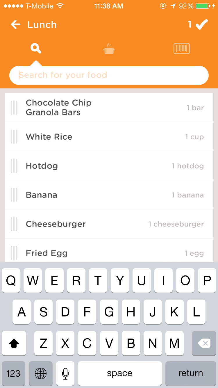
We observed users and saw that they were often unsure of what to do when navigating between different views while logging food. People weren't noticing the back or check buttons, and the buttons didn't always work the way people expected them to. On top of that, the UI and flow would subtly change depending on the entry case.
Mental Models
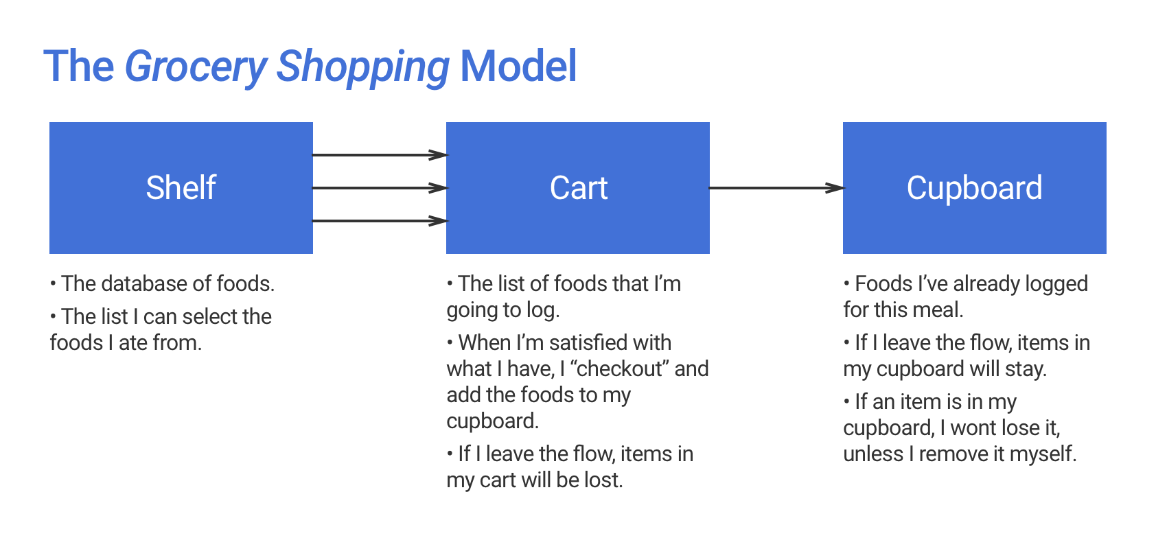
We noticed that part of the issue may be that the concept model of the feature may not be in sync with common mental models that users had.
After observing some remote tests and asking direct questions to local testers, we were able to nail down what we saw to be the most common mental model for the people tested. By establishing a grocery shopping metaphor and how users expected each to behave, we developed a concept model for the food-logging feature that we would use to base future design decisions off.
Requirements
We knew we would have to simplify the workflow and make the interface much more clear. From several specific criteria, we ended up with two overarching user requirements:
Users will act with confidence: All interactive elements will have a single clear purpose.
Users will not get lost: All cases will have an understandable flow and architecture.
Iteration
A main cause of confusion was that the interface and flow were different depending on whether you were logging a new meal or editing an old one.
The most basic solution to solving the confusion was to eliminate different cases, and settle on a single, universal flow for all cases. The issue with that is one of the entry cases now requires navigation through a meaningless screen to achieve the goal (i.e. If I'm editing a meal, I'm treated as if I'm logging a new one, or vice-versa).
Going Back
Another problem was that users struggled to go back to the home screen, or worse, accidentally went back when they didn't want to. Since a user can start the workflow anywhere, both the cart and search screens needed an intuitive way to return to the home screen.
Traditionally, this has been done with the back arrow, but we noticed this was too ambiguous. "Am I going back home, or to the previous screen?" users would think, and the correct answer depended on whether they were logging a new meal or editing. After some research and experimentation, we found that the clearest way to convey this behaviour was to use a cross (or ╳ ) icon.
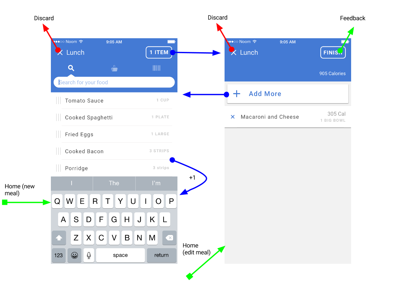
When prototyping screen transitions we noticed a problem. When the screens animated from one to the other, the behaviour of the close button was still ambiguous on the second screen. We found that there was a near 50/50 split between users who expected the button to close the entire flow vs. the current screen. This was because a second close button animated over top of the first
One X to rule them all
These weren’t two separate screens, but two parts of one experience. By designing the interaction and animation thoughtfully, I could convey the feeling of a single context in these two views.
I worked on this idea, and made an Origami prototype to show the single-context idea. While the interactions are a little over-designed, they effectively convey the single-context of food logging.
Finally, we had a single close button for both views, and an intuitive way to flip between them. I toned down the interaction to make it simpler to build, and by keeping a static close button and making the header a uniform size, it was possible to achieve the feeling of a single context for meal logging.
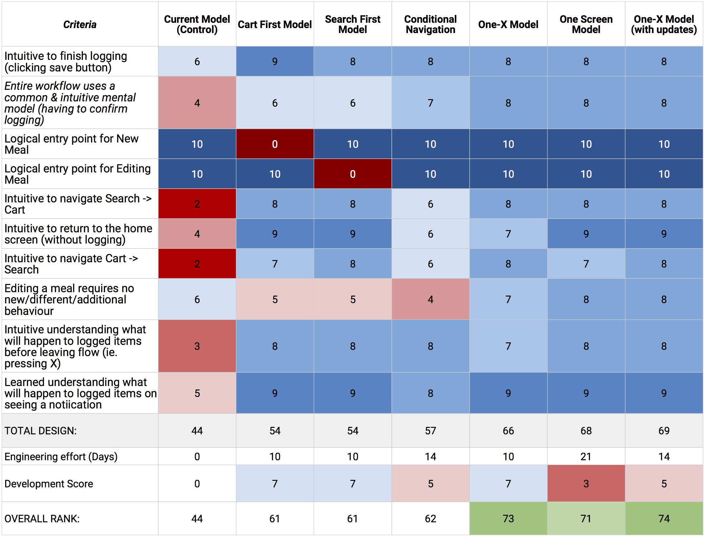
Testing & Validation
With the help of our User Research team we tested our designs and rated their performance against the usability criteria. We compiled these into a decision matrix, and included a developer estimate for each design. With this chart we were able to convince management that this design solved the problems, and got developer time to build the improvements.
We also tested different cart, and add more button designs. The buttons in the final prototype were the winning variants.
A Legacy
The Noom app features this version of the meal-logging workflow to date, and while my internship finished before the feature launched, I was told by the VP Engineering that the modifications I made to the workflow made a significant impact to user-reported ease in meal logging (a tracked KPI).
I'm grateful to have been part of a great design team that recently won the 2017 Red Dot Award for outstanding design.